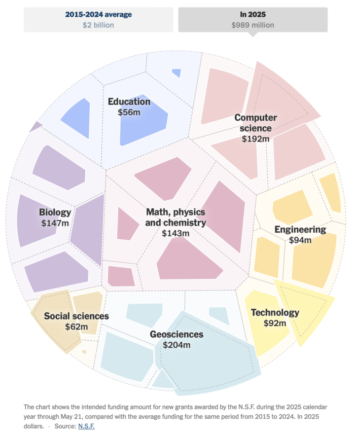
With a circular voronoi diagram, NYT’s the Upshot shows a much slower rate of funding from the National Science Foundation, through May 21.
The full cells show the average funding over the past decade up to the same date, and the darker cells show the current funding. It looks like there are four categories with more funding than usual. Everything else is a big cut.
In case this view looks familiar, the Upshot used a similar view to show infrastructure proposals a few years ago. Although this time the circles look like petri dishes, given the topic.
Rewind back further to 2008 for the O.G. consumer spending graphic.


